My Restaurant is English Italian and Contemporary, so this is a good field to research in to see direct competition .
Jamies Italian
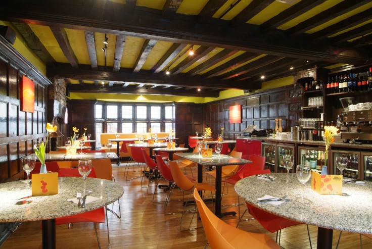
Interior/Exterior


The interior and exterior is again very homely. Bright Red chairs, Modern Fittings with a contemporary feel. Not too clean cut.
Menu / Identity

The logo combines the modern sans serif typeface with the classically serif 'Italian' underneath. I think this gives off the message that the Restaurant is quite contemporary but also classical in the food it serves.

The Menu is not too formal, it's quite contemporary design that is also very welcoming and homely to make the customer feel comfortable.
Website


The website keeps the consistent colour scheme following on from the menu. It is quite contemporary design but also really light hearted. Using modern typographic styles, appealing to a younger audience.
Ask Italian
Interior/Exterior


As you can see here from the Interior of both these Italians. Very Similar. Both Contemporary. both use lot's of Red, White and Earthy tones too to add the homely feel.
Menu / Identity
Logo is Fresh looking, Very modern. More so than Jamie s Italian, but this also goes fro the Interior. Good play on words and placement of type can reach out to quite a broad audience, whilst remaining fresh and up to date.

Again, similarities between Jamies Italian and Ask Menu. similar Price range for a start which is what I will be entering at. They both use this antique white background colour which adds to the 'homely' feel and similar colours are used in general. Orange and Red a reoccurring colour palette.
Website


Again, very similar to Jamies Italian, which the modern typography and colour scheme.
Prezzo
Interior/Exterior


Prezzo seems generally a little more 'classier' than the other two. Less homely but still gives off Italian vibes. The black and white colour scheme is clean cut and builds an identity for the company. I want to find a balance between this and the more 'homely' approach.
Menu / Identity
Logo is very clean cut again. Looks Sophisticated but also inviting enough to not be too expensive.

Surprisingly the price range is slightly lower than the other two italians but this doesn't really come across int eh branding which I'm not sure is a good or bad thing. The menu itself resembles that of wetherspoons so this is where the design has let the branding down.
Website


Website also lets the brand down more. I was expecting more of the black and white colour scheme to add a touch of class as a pose to this bright, clean cut but very 'common' style of branding, which could be linked to any cheap high street gastropub.
Pizza Express
Interior/Exterior

Menu/Identity
I really like the black and white Pizza Express Logo. It is timeless in one sense because it looks really old, very greek, handcrafted but also fits really well within a contemporary environment. I think they have found a perfect balance here. It's also very different to anything else around so instantly stands out.

The menu compliments this design perfectly. Much cleaner with white space with black text, still using this colour scheme. Introducing accents of this lime green to freshen it up, fit in with the colour seen in the photographic imagery, and to also highlight certain areas.
Website/App


Again, the website and App compliments the branding. I really like the use of the white horizontal lines in the logo and even in the uniforms as you can see in the image above. I feel that it's important to keep a constant brand that can be applied across various different product ranges. This is probably the most successful brand out of the ones I have research further into. They use the same colour scheme as Prezzo, but in a much more successful way in my opinion.
Various Other Competition
LEON Restaraunts


Wagamama


Strada


Leave your comment