- Train/Bus Stations
- Buses
- Shops
- Supermarkets
- Sports Stadiums
- Signs
- Tickets
- Newspapers
- Buildings
- Billboards

British Train Ticket - I like the design of this, it is symbolic and instantly recognisable. The bold orange lines are a general theme of the British rail company. The logo also in the bottom left is also another symbol that is instantly recognisable and something you can easily relate to the railway. The type is clear and understandable as the main purpose for this is to be understandable and to stand out.

Bus Advertisement for a zoo - Its a really cool idea making the bus look like it has been crushed by the snake. This shows that being innovative, thinking outside the box and not sticking to the same old things really can pull of and make your advertisement stand out miles above the rest. Seeing this would instantly grab my attention above everything else and would probably sub-conciously stay in my mind of making me want to visit a zoo.
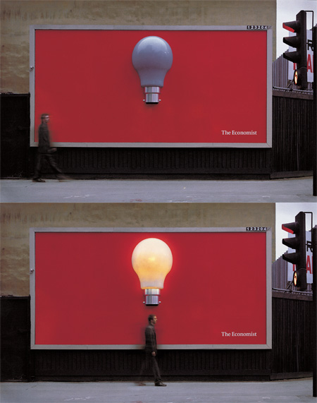
The Economist Billboard - Advertisement for the current affairs magazine. The bulb lights up by sensor when a person walks under it. Advertising that is really out there and something that you wouldn't miss or ever forget. Again, this is a really innovative piece of advertising and something that would stand out and stay in your mind above your regular billboard.
I decided to go for the 'Apple' logo. It is seen by me personally everyday as it is by millions of other people around the world also. I think, most people would know what this simple logo represents and could give you the answer instantly. It is simple, beautiful and iconic. It is definitely a piece of visual communication that will not go un-nnoticed and will not be forgotten for years to come. It represents the business too, sleek, minimalist, chrome, shiny and adds the desirable factor to it.

This clever billboard from New Zealand advertises Law & Order, a television police drama, with the cop bending the ad’s light fitting during a suspect’s interrogation. The design reflects that contemporary billboards continue to be an effective and often inventive medium for advertisers to find new ways of relating their message. This would stand out above any other billboard in my opinion and this is what we see now, advertising starts to become clever. There competition is high and companies and design agencies try to always get one up on each other and this is what really pushed innovative design.

Leave your comment