One of the ideas i had was to create a branding logo for 'Safe Side' to go with the locks. By approaching it in this way, i wanted to make it look like the company of the locks was called 'Safe Side' making the posters look almost like an advertising piece when you first look. Also with the proverb attached to this 'Its always better to be on the Safe Side', this reminded me of a company slogan and i'm considering patenting this before somebody steals my idea! haha!
I quite like this idea of having a double meaning behind the poster or at least hiding the proverb under some false identity for a lock company. At the moment, while it's fresh, this seems to be the prominent idea in my head which i want to be developing further. This may change slightly or fully by the time i start putting some stronger ideas together into practice.
I have started looking at some different logos/type that i can be influenced to create my own logo for 'Safe Side'.
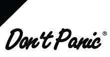
The Don't Panic logo, i really like. The combination of handwritten and neat and clean finish works well for this. definitely something i want to incorporate into my logo design.
Similarly to the 'Don't Panic' logo, the 'Fender' logo also takes this slanted handwritten look, which i think works really well.

Clothing brand, 'Stussy' is also a more scruffy, street art kind of style.
I would like to make my logo quite neat also and cursive. The kellogg's is a very good example of this on such a massive corporate scale.

Leave your comment